- First I used Adobe Illustrator's pen tool to create a line.
- Then I duplicated the line, and flipped it to create a shape.
- I then imported the shape into photoshop and duplicated it 4 times, rotating each version of the shape 90 degrees to form a cross.
- Then, I added a noise background and altered some layer's blending modes to help create my own texture.
- Next, I created a mask and added several colours to each shape using the brush tool.
- I then selected the mask whilst on a different layer and deleted the selection - leaving just the colour on each shape.
- Next, I created a colour-spectrum tone background by using several large brushes of various colours. I changed the blending mode to overlay so it blended into the 'noise background' - creating a nice 'rainbow' gradient texture.
Thursday 4 October 2012
Photoshop + Illustrator 'Shape' Tutorial
Sunday 30 September 2012
1.The
first thing I did when I created the image was to make a new project. I chose a
standard A4 page as my project.
2.Secondly I found a high resolution brick texture to use as a background
2.Secondly I found a high resolution brick texture to use as a background
3.Then
I found 3 images that I wanted to use to appear on the background
4.To do this, I made them black and white, lowered the opacity and changed the layer’s blend modes to multiply.
5.Then I added text to the page
4.To do this, I made them black and white, lowered the opacity and changed the layer’s blend modes to multiply.
5.Then I added text to the page
6.I
changed the font to match my work’s style and lowered the opacity to make it
blend into the background. I then added a shadow to make it look more realistic

Tuesday 25 September 2012

Bank gothic is a sans serif font that was created in 1930. I like this font because of how the font itself helps to establish the genre of text that it is used in. For example, Bank gothic is used in a huge amount of action movies / games. Seeing this font creates connotations of a espionage / thriller atmosphere.
Examples of Bank Gothic's use in modern media are:
- 24
- Battlestar Galatica
- Hancock
- The Hunger Games
- Grand Theft Auto
- Call of Duty
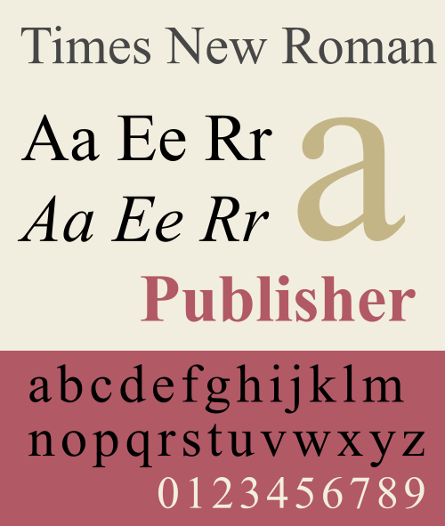
Times New Roman is a good example of a well known and successful serif typeface. It is easily recognisable because of its use in Microsoft products, as well as many books across the United States. The font is easy to read, whilst still maintaining its old formal lettering. It originated from The Times newspaper in 1931
Futura Font

Futura is a type face that I am particulary interested in because of the simplistic style of the font. It is a sans serif font that originated in Germany in 1927.
There are many different styles in it's font family such as light, medium and bold, as well as an italic set which was added in 1955.
What I like about this type face is how it maintains a direct and formal style, without going over the top whilst still maintaining a friendly and welcoming approach.
It is also easily recognisable, having featured on a variety of media platforms, such as in 'V for Vendetta' and in 'The Elder Scrolls V: Skyrim'
Another thing I like about Futura is how each character is in proportion - the 'O's are perfectly round.
_Interface.png)
Monday 17 September 2012


Subscribe to:
Posts (Atom)